I wanted to keep my original logo but just to add motion graphic elements. These are some of the designs I came up with and still playing with as we speak...
*TYPEFACE LOGO RE-BRAND*

#1 - I wanted some key elements representing motion graphics and video editing so I incorporated the "Play from Start" symbol as a spacer for my name and the word "design." I also added a dot for the lower case "j" which is actually the record symbol.
#2 - Nothing too big of a change but what I did was kern each letter to have closer proximity. Wasn't really enjoying it too much but I was fiddling around to see how it would come out.
#3 - On here I wanted to use my original typeface logo, which is my initials "FJD" and the "J" is actually replaced with the side-view of an Owl that I illustrated. But on this new concept, I changed the beak of the Owl and used the "Play from Start" symbol. Something was still missing so I tried something else...
#4 - I kept the same design as #3 but I added more exposure of the owl's side by illustrating just some portion of the head just to display that it's an owl. I'm enjoying this one very much but will continue to play around with the different variations I sketched out.
"LOGO RE-BRAND INCORPORATING MOTION GRAPHICS"
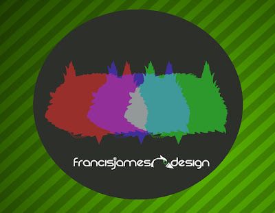
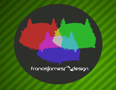
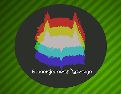
For these 3 I wanted the elements of RGB to be placed within my original logo. So I gave my logo an overlay to manipulate a silhouette and changed the color overlays to Red, Green and Blue. These are just the different placements I came up with. To be honest, I like the 3rd one out of the 3.
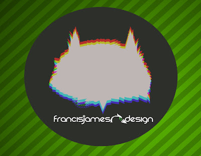
For this one, I wanted to give it that old-school "3D" feel. You know, where you go into the theaters and wear the blue and red 3D glasses and you would see something like shown above....it hurts the eyes just a bit but also shows that it's got a "3D" feel and what do people think when they see 3D? Movies. And when movies is in mind, you would think "Oh this person is probably involved with some special effects of some sort."

Now this has to be one of my favorites out of all the designs, excluding the typeface logo. The silhouettes moving at a diagonal motion represents the "Motion Blur" button in After Effects. It's one of my most used tools and it just makes things look better!
So there you have it! Let me know what you think!


 Congrats to the stunning and superb artist, Pogo for his new official logo. The simplicity of it's design expresses so much. (Look closer and you'll see that it resembles a classic Walt Disney character). The Space Bunny Logo was actually hand drawn by a friend of his and he took that sketch and digitally drew it. The finalized product was then completed by Tymn Armstrong, an amazing graphics artist. His simplistic work is really intriguing. Check out the rest of his work at http://cargocollective.com/tymnarmstrong


